Table of Contents
Top 7 Cryptocurrency Logos
- Bitcoin
- Ripple
- Lite coin
- Dash
- NEM
- Monero
- Z cash
Crypto currency is a growing mega-trend and crypto logo designs may influence our choice of whether we should or should not trust and invest in one.
I’ve reviewed some of the best cryptocurrencies in terms of the visual esthetic of their logos in order to give you an opinion on what’s good about them and what is not.
And also, a logo is how something is recognized and understood.
This is critical especially when it comes to your hard-earned money.
All banks and financial institutions know that and their branding is on point.Just look at examples like: Chase bank, Bank of America, TD Bank etc.
But, once I’ve seen some of the top cryptocurrencies and their logos I was deeply disturbed.
Branding Of Cryptocurrency
Most of the new cryptocurrency logos are poorly designed.
They actually look like created by some kind of crypto logo maker.
It’s kind of surprising, that their owners and/or investor don’t realize the importance of visual consistency.
Therefore, my goal as a designer is to point out the good and the bad things about them.
So that during you logo design process, you can focus on what works and avoid making potentially costly mistakes.
I strongly believe that good design is good business.
Simplicity & Clarity
By adhering to the five criteria of successful crypto logo design, I have analyzed seven top crypto logo with Bitcoin in the middle plus 6 alternative cryptocurrencies.
Crypto Logos Explained
- Bitcoin
- Ripple
- Lite coin
- Dash
- NEM
- Monero
- Z cash
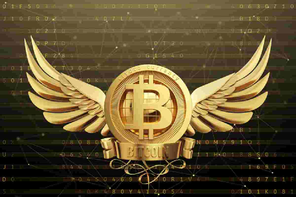
1.Bitcoin
Bitcoin cryptocurrency is the world’s first peer-to-peer decentralized digital currency and the most recognized and known crypto logo as of now.
Bitcoin symbol – a capital letter B with two falling strokes at the top and bottom directly refer to a dollar sign which I believe is the best single visual treatment in this logo.
The distinctive “B” is imposed on an orange circle that makes it actually look like a coin.
Next, the coin is slightly slanted to the right which together with the italic wordmark add to dynamism of this volatile currency.
bitcoin logo design analysis
Bitcoin——logo analysis
- Pros
- visual nod to the dollar sign
- bold, simple typography
- reference to a coin
- distinctive color
- Cons
- generic look
the serif “B” and the sans serif wordmark don’t match
inaccurate proportions between logo and wordmark
2.Ripple
Ripple connects banks, payment providers, digital asset exchanges and corporates via RippleNet to provide one frictionless experience to send money globally.
In terms of visual aesthetics, it’s the absolute winner.
Ripple got in its logo three dots, which connected together form a unique symbol that can represent the blockchain technology. The logo is simple, memorable & modern.
The particles are in perfect relation to each other forming a triangle which is aligned to the right, so it sort of sticks to the logotype.
The subtle gradient applied on the mark looks modern plus the blue color evoke trust and wisdom.
ripple logo design analysis
Ripple——logo analysis
- Pros
- the simple and bold typography with just right letterspacing
- the symbol conveys decentralization, connectivity, flow
- the blue gradient that evokes trust and wisdom
- perfect proportions between the symbol and the wordmark
3.Lite coin
Lite coin is a peer-to-peer crypto logo and open source software project released under the MIT/X11 license.
Lite coin mark is actually an existing character from a computer’s character map and a letter of the Polish alphabet, which makes it look recognizable instantly.
Uses a distinctive first letter of its name – similarly to Bitcoin.
However, the letter exists in some alphabets like Polish e.g. (my origins) and the pronunciation is very different than “L”.
It may cause some confusion. On top of that, the symbol uses Uppercase while we name uses lowercase.
The symbol is in italic while the wordmark is not.
The symbol is bold while the wordmark is set in the light font.
The grey color makes it look weak and it projects overall poor impression.
Lite coin—logo analysis
- simple and legible typography
- reference to a coin (circle)
- right balance between symbol and wordmark
- Cons
- Is an existing letter is Polish, confusing
- lack of visual link between “Ł” from symbol and lowercase “l”
- grey color make is look very weak and fragile
4.Dash
Use Dash to make instant, private payments online or in-store using our secure open-source platform hosted by thousands of users around the world.
Dash name stand for Digital + Cash. The name is set in a custom typeface that is bold, dynamic and distinctive enough to make an impact.
Dash is Digital Cash you can spend anywhere.
That’s the first thing we can see on the Dash website.
Well, it makes sense since the name combines the first letter of “Digital” with the word “Cash”.
- D + Cash = Dash. A great name and also a great logotype.
- Dash logo design analysis
- Dash——logo analysis
- Pros
- unique typography
- distinctive D
- dynamic wordmark
- Cons
- omnipresent blue color (like Chase)
5.NEM
NEM is the world’s first Smart Asset blockchain.
However, built from the ground up for enterprise-grade performance, NEM’s blockchain technology delivers a world-class platform for management of almost any kind of asset: currencies, supply chains, notarizations, ownership records and more.
Helvetica with tight letters-pacing will always look good. The colorful three-arm symbol is not bad, but the proportion between symbol and wordmark are inaccurate.
Helvetica-like typography set in bold with tight letterspacing will always look good.
We can find so many brands using a similar typeface in their logos (Lufthansa, Jeep, Gil et t e).
The three-arm symbol is appropriate and set in bright colors makes it look very appealing, however the proportions between wordmark and symbol are way off balance.
- simple & bold typography
- distinctive symbol (triskelion)
- vibrant colors
- Cons
- symbol and wordmark off balance (proportions)
- weird position of the symbol (as it’s a star)
6.Monero
Monero is a secure, private, and untraceable cryptocurrency.
It is open-source and accessible to all. With Monero, you are your own bank.
Only you control and are responsible for your funds.
Your accounts and transactions are kept private from prying eyes.
The “M” in the symbol divides the circle into 2 parts and the color separates it further which looks somehow original. However, the wordmark’s “M” is of a different shape which makes it look inconsistent.
The name is set in all caps and legible sans serif typography.
However, the weight of the font and the weight of the line in the “M” symbol doesn’t match.
The first letter of the name uses totally different “M” than the one in the circle (inconsistency).
- simple & legible typography
- distinctive treatment with the M dividing the circle
- vibrant orange color
- Cons
- generic symbol
- “M” in the symbol does n’t match “M” in the name
- Color separates the top part of the negative space (no purpose)
7.Zcash
So, Z cash is the first open, permission less cryptocurrency that can fully protect the privacy of transactions using zero-knowledge cryptography.
At first glance, Z cash logo looks like a copy-cat of Bitcoin. And also, hold on, it is a copy-cat. So, same treatment, slightly different execution. Even the color is too similar. Not so smart guys, not so smart.
However, the logo wasn’t designed to work separately from the name (like Bitcoin).
So if you separated the coin-like “Z” symbol from the name – you just end up with “Cash” word.
- coin-like symbol
- subtle orange gradient
- Cons
- very generic, standard looking typography
- the stroke is too thick on the symbol
- “Z” should be repeated in the wordmark
Conclusions
When it comes to money investment, you want to particularly pay attention to the visual aspects of your identity system with a logo in its core.
I’ve reviewed these cryptocurrency logos, so you can actually learn from the life-case scenarios and avoid potentially costly mistakes when it comes to your logo design.
Remember, whether it’s a new cryptocurrency, financial institution or any other business or venture – logo design principles are always the same.
An effective logo is more than the sum of its parts. Therefore, colors, shapes, fonts, and words chosen all need to work together to form a harmonious whole.
Therefore, every decision you make when you pick a logo can have an impact on the way your brand is perceived.
Will it work across variety of media?
So, designers like me, use these forms of visual language (among others) to make sure that the brand comes to life in the most appropriate manner and makes an impact from the first encounter.
Color the colors you choose for your logo send an immediate message to the people who see it.
If you select colors that don’t work well with the brand personality you want to convey, then you may lose people as soon as they see your logo.
Bitcoin g—color analysis
Bitcoin color[/caption]Certain colors speak directly to the industries they represent.
In finances, blue is a common choice for the banking industry because of the symbolic link between blue and trust, calmness, flow.
Shape the shapes you use in your logo, as well as the logo’s overall shape, is important, too.
Circles tend to convey warmth and community, and also it’s also the shape of coin.
Bitcoin shape
Bitcoin shape[/caption]Square and rectangles are more orderly and balanced, while triangles can signify excitement.
Sometimes a company might use one shape inside their logo (square inside the chase bank), but use a different one as the shape of the logo as a whole.
Type face many logos incorporate the names of companies or their slogans.
In such cases, the fonts you pick are just as important as the words.
You may choose to use a fancy or elaborate font in your logo, but your first consideration should always be readability.
Bitcoin—type analysis
Bitcoin typeface[/caption]Logo designers sometimes use fonts and then embellish them with other design elements.
Again, the font you choose should do a good job of representing your brand’s image and mission.
Overall look & feel
So, finally, you need to think about the emotions conveyed by your logo.
And also, everything should work together to create a harmonious whole.
Looking for a crypto logo design? – Get my quote Today.
A company that targets investors might use a strong and solid color such as blue, combined with a sans serif font and a circular shape.
The combined effect sends a clear message that this is a company that can be trusted, is progressive and also capable.