tAccording to a study by Kissmetrics, the visitor in the first 90 seconds makes a decision whether to stay on the site. At the same time, according to various estimates, 65-90% of users form an impression based on the color of the site. Therefore, the psychology of color in design is important for promoting any site, be it https://slot-mystery-museum.com/ or Netflix.
Let’s look at how colors influence a person, how to choose a color for your niche, how to make a brand recognizable and what colors in design are better to avoid to stimulate sales.
A website’s color has many functions. It can make a website more memorable and the user experience more enjoyable. It can evoke an emotional response and increase conversion rates.
Color also helps build a hierarchy of content to focus attention on key information and calls to action. Let’s take a look at what colors are best to use in design and what emotions they convey.
Table of Contents
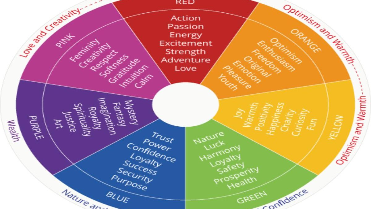
Red
Red is a selling color, a symbol of power, energy, passion, urgency. Easily attracts attention and can evoke strong and immediate reactions. Since the color is very popular, it is advisable to make the color recognizable by experimenting with shades of red. Because of its ability to persuade people to act “here and now,” it’s actively used for the design of sales and fast food chains. If you need a quick conversion, use red.
Green
The color of health, security, harmony, loyalty, security (including financial security). Suitable for brands that want to give customers a sense of security. Stores often use green to relax customers and make them more determined to buy (by the way, this is one of the reasons why there are shelves with green fruits and vegetables at the entrance to supermarkets).
In the psychology of color in design, this color is associated with nature and is usually used to emphasize the sustainability of brands. Financial companies can use it to associate the brand with a sense of wealth and increase conversions.
Blue
The best color to evoke confidence in customers, which is why it’s actively used by medical and financial companies. Blue evokes a sense of security, confidence and trustworthiness and easily gains credibility. Blue stimulates brain productivity, it’s associated with communication and intelligence and is often used in social networks. Additional properties of blue are its ability to reduce pre-purchase anxiety, increasing conversion rates.
Pink
Pink is a bright color that’s hard to miss. It sets customers on a wave of inspiration, romance, hope and excitement. It’s perfect if your purpose is to evoke memories from childhood, to direct a person to the world of fantasy and magic. That is for sellers of desserts, cosmetics, toys and products for children. Pink will also be a great solution for experienced brands who want to expand their target audience and improve conversion rates among young people.
Purple
The meaning of the color is quite broad. Purple reminds people of respect, prestige, sophistication, noble royalty, elegance. Choose it if you have high-end merchandise and it should evoke a sense of luxury. Great for the image of “noble beautiful old age” – that is, to increase the conversion of anti-aging products. If necessary, it can evoke a sense of mystique, indispensable for fancy brands.
Yellow
The first color that comes to mind when the words “happiness,” “warmth,” “positivity,” and “light” come to mind is yellow. A yellow site is a great way to energize people with a sense of optimism, hope, motivation, and encouragement. Sometimes yellow unintentionally emphasizes the affordability of a product and increases the conversion rate of products with an affordable price. However, you have to be careful with yellow: In large quantities, instead of improving mood, it can cause agitation and anxiety.
Gold
It is the main color of luxury brands and has always been associated with wealth, glamor, and victory. Gold usually evokes a subconscious belief that you have a quality product in front of you. However, there are peculiarities in the use of gold. As you remember, yellow is associated with affordability (i.e. cheapness). Therefore, if the product is expensive, it’s better to use gold with brown or red tones to increase conversions in marketing.
Orange
A golden balance between optimistic yellow and energetic red. As a result, people feel eager to communicate, invigorated, excited. The perfect conversion boosting option for brands that want to evoke a craving for adventure, for innovative and cool products. The right shade increases feelings of friendliness and vitality, and sets a positive mood. But look out for orange, which is used on warning signs. It’s better not to use it, so as not to cause unnecessary anxiety.
Brown
A soothing earthy brown gives people a sense of simplicity. Helps brands build an image of safety, stability, reliability and durability. Also suitable for boosting conversions for nature-related companies. As with gray, you need to use it carefully so as not to make the site look boring and bland.
Silver
Silver is a sleek color of elegance and grace, a great selling color. It’s used to increase the conversion rate of high-end product sites to create a sense of wealth. Therefore, silver can often be found on the sites of jewelry brands. Besides this, silver is used for industrial or technological goods that are related to machines.
Rainbow
Many successful brands have different colors of the rainbow on their website. This solution allows you to convey versatility. So you can look towards the rainbow, if your goal is to focus on a wide base of customers. But it’s worth thinking carefully before resorting to such a technique, so as not to provoke the view that the brand is indecisive or cannot decide on the category of customers. In this case, the conversion may be lower.
Black
If you are looking for the color of strength, authority, stability and power, choose black.
It’s perfect if you want to convey mystery, sophistication, timelessness and luxury. It’s a universal color that creates harmony between contrasting colors and looks great on its own. Depending on the context, black can convey both traditional and contemporary brand character. Therefore, it can increase the conversion rate of almost any brand.
White
White is an indispensable color for a cleaning services website and the healthcare industry. Transmits purity and simplicity, can be used as a blank canvas with limitless possibilities for creativity. Advised to use to increase conversions for brands that motivate customers to create something of their own. White is often found in minimalist brand design, combined with contrasting colors. Here, however, it’s worth paying close attention to your brand’s audience. In China, Japan, and other Eastern countries, white isn’t associated with trust, gentleness and nobility, but with mourning.
Gray
Gray is the color of modesty. It’s also the color of dignity, stability and practicality. Evokes a sense of trust and professionalism and is actively used by equipment companies, also technological, transport and financial companies. But you need to use the color carefully because the gray site can emphasize the non-seriousness and traditionalism of the brand, and dullness and drabness. As a result, conversions will, on the contrary, go down.
How to Combine Colors in a Design
As defined by Wikipedia, the Color Circle is a way of representing the colors of the visible spectrum in a conditional form, denoting different color patterns. Sectors of the circle represent definable colors placed in an order conventionally close to the arrangement in the spectrum of visible light, with a conditional magenta color added to the circle, which links the extreme spectral colors.
Ideally, for maximum conversion, the palette should be limited to two or three colors, so as not to complicate the design of the site and overload the users. The most common color palettes generally fall into the following categories:
- Monochromatic – shades or tones of one color are used.
- Analog – uses colors next to each other on the color wheel.
- Complementary – created from two colors opposite each other on the color wheel. According to the psychology of color in design, they work very well where a high level of contrast is required.
- Split Complementary – Like complementary, which uses the opposite color, this palette uses two opposite colors.
- Triad – is created from three colors evenly spaced throughout the color wheel.
- Tetradic – also known as a rectangle, uses four colors. This allows for many variations in design.
4 Color Mistakes to Avoid
Don’t Use Pure Black (#000000)
Pure black visually often looks too overwhelming. In fact, nothing is ever 100% black: not hair, not charcoal, not smart TV. Bootstrap and Foundation, the Photoshop UI, the keys on your MacBook are not all black. Color psychology in design advises adding some soft color to our black: even something like #111111 will be much more to the eye.
Red and Green Should Never Be Seen
You shouldn’t combine these two colors because of deuteranopia, a form of colorblindness that makes it difficult to distinguish between two colors. In addition, this combination confuses emotions. Red means “no,” and green means “yes,” as behavioral scientists and various user experience experts explain. That’s why red-green sites have low net conversions.
Neon Colors
Neon colors can be incredibly beautiful, bright and attractive colors in art and illustration. However, in website design, they cause disgust and general irritation. According to the psychology of color in design, it’s appropriate to use them only in retro-themed, or background images that contribute to the emotion and mood of the design.
Bright Colors With Brighter Colors
By using bright colors on top of brighter colors, you risk causing an instant migraine. Using too many harsh, high-contrast hues next to each other will confuse your eyes and brain. But white colors on a light background have the same effect: be careful.
Tools to Help You Choose the Right Colors
When it comes to web interface design, you don’t need to reinvent the color wheel. Just pick a color with one of the popular tools – and it will take into account the psychology of color in the design itself.
- Adobe Color CC is a reliable assistant to Adobe users.
- Paletton is a simple color palette for beginners.
- Flat UI Color Picker is perfect for creating colorful flat designs.
- Mudcube Color Sphere offers a choice of themes and provides HEX numbers.
- Check My Colors is used to check foreground and background color combinations and make sure it has the right contrast for use by people with colorblindness.
Remember: high conversion is not only the ability to convince customers on a logical level, but also the ability to manage their emotions. Use our tips for color matching and create sales-promoting sites that get right to the heart of your target audience!