
Table of Contents
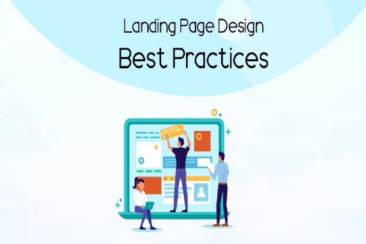
Landing Page Design Best Practices
Landing page design best practices focus on creating pages that visitors reach after clicking a marketing call to action.
It could be a search or display ad, an email, a social media post, or an affiliate link. Effective landing pages should also provide relevant content and clear landing page navigation, so visitors can easily find the information they expect after clicking an advertisement. Google highlights relevance and easy navigation as important considerations for landing pages.
This Article Belongs to Content Marketing
Many companies send traffic from those referring sources to their home page, but that’s a mistake. Instead, landing pages deliver several benefits, including a clear offer that aligns with whatever the referring source is.
A well-designed landing page gives visitors the information they expect and guides them towards one specific action. This can result in higher conversions than simply sending new visitors to the home page and hoping they figure out how to find what was offered when they clicked.
Landing pages should also be part of a broader digital marketing practices strategy, where advertising, content, SEO and conversion optimisation work together rather than operating as separate activities.
1. Do Highlight the Benefits
- Product designers want to focus on features; consumers want to know about the benefits. They want to see how those features impact their experience.
- A person doesn’t buy a car because of its 300hp; they buy it because that 300hp allows them to go fast.
- That’s why many car ads mention their 0-60 times instead of just horsepower numbers.
- The same principle applies to software, services, subscriptions and online products. Visitors should quickly understand what they gain by taking the desired action.
- Strong landing page copy should therefore connect product features with real customer outcomes instead of simply listing specifications.
For example, instead of saying that a software platform has automated reporting, explain that it can reduce the time employees spend creating reports manually. Benefits make an offer easier to understand and can give visitors a stronger reason to continue.
2. Do Use Relevant Images
- People are visual creatures. A shortage of images can be frightening to a person viewing a landing page. On the other hand, good photos add a sense of trust between the consumer and the company.
- There are many images that can be used effectively for landing pages. Of course, product images are the most obvious choice.
- As workers respond better to pictures of real people, images of persons using the product are even more compelling.
- On the other hand, stock photos of models don’t necessarily add to the user’s experience.
- Landing page designers should use images that create an emotional response while remaining relevant to the people and offer being presented.
- Images should support the message rather than distract visitors from the call-to-action.
The quality and relevance of visual content also matter for user experience. Google recommends paying attention to the overall page experience, including how content displays on mobile devices and whether the main content is easy for visitors to distinguish.
3. Do Test Your CTAs
- Arguably the essential part of any landing page is the call-to-action. Because of their importance, designers need to test their CTAs to ensure they’re optimised to get the highest positive responses from visitors.
- A/B testing is a simple way to test this. Designers can have two landing pages randomly shown to visitors for a set time, each identical except for differences in the CTA itself.
- After that, they can continue to refine and test until the CTA gets the desired results.
- Designers must consider testing things like the CTA button colour, the language surrounding the CTA (and on the button itself), and the placement of the CTA on the page.
- Other parts of the landing page can also be A/B tested for better overall results.
Testing should be based on meaningful conversion data rather than assumptions. Depending on the campaign, businesses might measure form submissions, purchases, registrations, downloads or booked appointments.
The most effective CTA is also one that matches the visitor’s intent. A visitor who has just discovered a brand may need an educational offer, while someone further down the buying journey may be ready for a product demonstration or purchase.
4. Do Make It Mobile-friendly
- Seeing the number of people browsing the web on their mobile devices, it is a mistake for designers to overlook how their landing pages will look on smaller screens.
- While one option is to create a layout that looks good on mobile devices, simplifying your landing page to be more effective on mobile is an even better idea.
- However, mobile device compatibility is essential for landing pages targeting social media posts, advertisements, or emails.
- People don’t just surf social media and read email on their smartphones.
- They make purchases, sign up for services, submit forms, and otherwise complete the actions that companies want them to take.
- Designers who overlook this considerable market share are shortsighted at best.
A mobile-friendly landing page should have readable text, appropriately sized buttons, fast-loading images and a layout that does not require excessive horizontal scrolling. Forms should also be as short and straightforward as possible.
Google’s current guidance on page experience specifically recommends ensuring that content displays well on mobile devices and that pages provide a good overall user experience.
5. Keep the Message Consistent
A landing page should match the message that brought the visitor there.
If an advertisement promises a particular discount, service or solution, visitors should immediately see that same offer on the landing page. Changing the message can create confusion and make people question whether they have reached the correct page.
This is especially important for paid advertising campaigns. The headline, supporting copy, images and CTA should work together to reinforce the original marketing message.
Consistency also helps businesses build trust. Visitors should not have to search through multiple pages to understand what they were promised.
6. Reduce Distractions
Landing pages generally work best when they have a clear purpose.
Too many navigation options, unrelated offers, excessive text, pop-ups or competing CTAs can distract visitors from the primary action. A focused design helps guide attention towards the most important information.
Businesses should also make sure that important content is easy to find. A visitor should be able to understand the offer, its main benefit and the next step without unnecessary effort.
7. Build Landing Pages Around Growth Goals
Landing pages should not be treated as isolated design projects. They should connect with the wider marketing strategy and be continuously improved using performance data.
This is where understanding the right skills to improve your digital marketing can help teams make better decisions about analytics, content, optimisation and campaign performance.
Landing page performance can also benefit from experimentation beyond simple CTA changes. Businesses can test headlines, images, page structure, forms, testimonials, offers and other elements to identify what improves conversions.
8. Learn From Growth-Hacking Strategies
Testing landing pages can also form part of a broader growth strategy. Businesses can study different growth hacking examples to understand how companies experiment with acquisition, conversion and retention.
However, growth experiments should always have a clear objective and measurable outcome. A tactic that works for one business may not produce the same results for another audience, product or market.
Conclusion
Landing page design is about more than making a page look attractive. The strongest landing pages connect the visitor’s intent with a relevant offer and make the next action obvious.
Businesses should focus on clear benefits, relevant images, strong CTAs, mobile usability, consistent messaging and continuous testing. When these elements work together, landing pages can become an important part of a wider digital marketing and conversion strategy.
A successful landing page is ultimately one that makes it easier for the right visitor to understand the offer and take the intended action.
